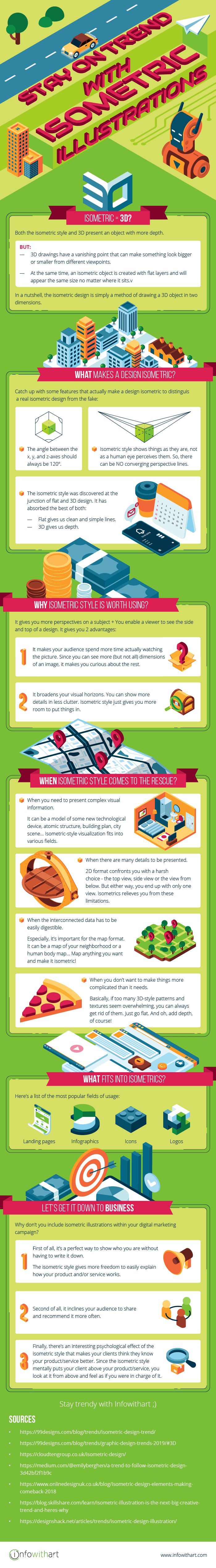
Stay on Trend with Isometric Illustrations
19th of July, 2019 | Infowithart
Are you trying to keep your designs trendy? Our team surely does its best to do so. Thus, we decided to share our personal view on what trend is at the top of all tops this year.
Well, the name of our article speaks for itself. The isometric design turned out to be the most sought after among our clients. So, our curiosity went a little bit further. And, as usual, we wanted to figure out what’s up with the hype.
Isometric = 3D?
No. Certainly, they both present the object with more depth. But 3D drawings have a vanishing point that can make something look bigger or smaller from different viewpoints. At the same time, an isometric object is created with flat layers and will appear the same size no matter where it sits.
In a nutshell, the isometric design is used to create three-dimensional objects as crisp 2D vector art. It’s simply a method of drawing a 3D object in two dimensions. On the one hand, an illustration is still simple and flat. On the other hand, a designer adds depth to it using geometric planes and isometric projection. As a result, we end up with an illusion achieved by shadows and a different perspective.
What makes a design isometric?
Isometric art varies from icons to animated infographics. It can be made of simple shapes or be more detailed. Its color palette may be limited to black and white or involve an abundance of colors. Surely, isometric style gives designers some ways to the flight of fancy. Anyway, there are some features that actually make a design isometric. Catch up with them to distinguish a real isometric design from the fake:
• The angle between the x, y, and z-axes should always be 120º.
• Isometric style shows things as they are, not as a human eye perceives them. For instance, when we look at some building, the parallel lines receding into the distance converge into a vanishing point. However, this is not the case when it comes to isometrics. There can be NO converging perspective lines.
• The isometric style was discovered at the junction of flat and 3D design. It has absorbed the best of both. Flat gives us clean and simple lines. 3D gives us depth.
WHY isometric style is worth using?
It gives you more perspectives on a subject. You enable a viewer to see the side and top of a design. So what?
Firstly, it makes your audience spend more time actually watching the picture. Since you can see more (but not all) dimensions of an image, it makes you curious about the rest. Eye-tracking studies have proven that readers are more likely to spend time looking at the information-carrying picture rather than reading some text on the same topic.
Secondly, it broadens your visual horizons. You can show more details in less clutter. Isometric style just gives you more room to put things in.
WHEN isometric style comes to the rescue?
• When you need to present complex visual information. It can be a model of some new technological device, atomic structure, building plan, city scene.. Actually, there are no boundaries! Isometric-style visualization fits into various fields.
• When there are many details to be presented. Obviously, it often overlaps with the first point. The main idea here is that 2D format confronts you with a harsh choice – the top view or side view. Well, sometimes, there might be a view from below. But either way, you end up with only one view. Isometrics relieves you from these limitations.
• When the interconnected data has to be easily digestible. Especially, it’s important for the map format. It can be a map of your neighborhood or a human body map. Again, no boundaries! Map anything you want and make it isometric!
• When you don’t want to make things more complicated than it needs. Basically, if too many 3D-style patterns and textures seem overwhelming, you can always get rid of them. Just go flat. And oh, add depth, of course!
WHAT fits into isometrics?
We might say that there are no limits once more. But you’ve guessed the answer anyway. Thus, we’re just going to list the most popular fields of usage:
• Landing pages. For those who want to demonstrate their product functionality in greater depth, isometric illustrations are a perfect choice. Because they can show the unique selling points of the company’s various products and services.
• Infographics. Infographic pieces usually explain some complex concept, visualize lots of data, and are often presented in the form of roadmaps and cheatsheets. Seems like fertile ground for the isometric style!
• Icons. With structure and depth, icons are more likely to grab users’ attention. Just because they stand out more at the background of their flat two-dimensional friends. Plus, the ability to see the top and side of an icon makes it more user-friendly.
• Logos. It’s the same story as with icons. The illusion of dimension and depth is simply more luring.
Let’s get it down to business
Have you already boosted your business with infographics? If no, make sure to fill this gap. You can actually empower your visual marketing strategy with this effective, yet simple tool.
For those who answered yes, there’s no reason to rest on your laurels. We have a new suggestion for the consideration of your head of marketing! Why don’t you include isometric illustrations within your digital marketing campaign?
First of all, it’s a perfect way to show who you are without having to write it down. The isometric style gives more freedom to easily explain how your product and/or service works. It’s an ideal visual metaphor for those whose product/service looks great in 3D as well as for those who provide the whole range of different options for their clients.
Second of all, showcasing important information about your products and services in such a clear and appealing way will incline your audience to share and recommend it more often.
Finally, there’s an interesting psychological effect of the isometric style. It mentally puts your client above your product/service. And when you look at something from above, you feel as if you were in charge of it. Thus, the high angle in isometric graphics makes the viewers feel like they control the process or object described and, as a consequence, think that they know it better.
And even if you don’t feel like using the isometric style for your design, marketing or any other purposes today, no worries! There’s plenty of other options out there. Just check our article “Top-10 Infographic Design Styles” and stay trendy with Infowithart 😉
SOURCES
99designs.com/blog/trends/isometric-design-trend/
99designs.com/blog/trends/graphic-design-trends-2019/#3D
cloudtengroup.co.uk/isometric-design/
medium.com/@emilyberghen/a-trend-to-follow-isometric-design-3d42bf2f1b9c
www.onlinedesignuk.co.uk/blog/Isometric-design-elements-making-comeback-2018
blog.skillshare.com/learn/isometric-illustration-is-the-next-big-creative-trend-and-heres-why
designshack.net/articles/trends/isometric-design-illustration/