Top-10 Infographics Design Styles
07th of February, 2019 | Infowithart
Our “How to Create Infographics” series is still going on. And today it’s time for the fifth article. Wanted another top-10 list from us? We’re not long in coming! This time we’re going to talk about the most popular styles used in infographics design.
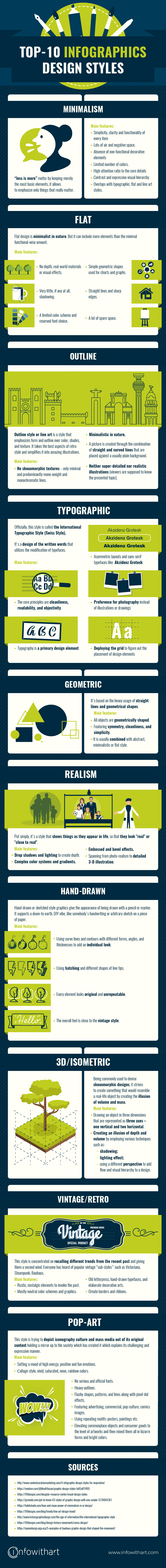
Minimalism
Minimalism is the opposite to lavish and highly-decorative styles. Its motto can be described with a popular “less is more” phrase. It’s aiming at creating designs with the bare minimum needed. By keeping merely the most basic elements, it allows to emphasize only things that really matter.
Main features
* Simplicity, clarity and functionality of every item are at the heart of minimalist philosophy. The other features hereunder arise from those fundamentals.
* Adding air and leaving lots of negative space.
* Absence of non-functional decorative elements, limited number of colors (or quite often a monochrome color palette).
* High attention ratio to the core details, proportions, and the whole composition. For instance, you won’t find a lot of visuals in the minimalist design. But be sure, those that would pass a tough and thorough selection, would be really catchy. Moreover, they would perfectly complement your topic and set the needed mood at a glance.
* Using contrast and expressive visual hierarchy as a means to reach a good visual performance.
* Overlaps (although isn’t mutually exclusive) with such styles as:
Typographic: typography is the core visual ;element in the minimalistic design. Its role doesn’t end with informing the viewers about the content. You can set the right style with fonts and enhance your visual performance.
Flat: flat-style images usually use fewer elements and curves, avoid highlights, shadows, gradients, or textures. No wonder, it’s a great match for minimalistic designs.
Line art: fluid or straight lines are perfectly coupled with minimalism. Neat, usually colorless and often elegant, outline illustrations. Nothing redundant here.
Flat
Flat design is minimalist in nature. Since it employs minimal use of colors and shading, it can even be considered as a subcategory of the minimalist look. Nevertheless, “flat” and “minimalist” are not interchangeable terms. Just to give you an example, flat-style infographic piece usually looks simple but it can include more elements than the minimal functional-wise amount. Likewise, the minimalistic design may go with photos or realistic illustrations instead of the slat-style visuals.
Main features
* Minimalistic approach is reflected in the willing to simplify the design (choice of colors, fonts etc.).
* No depth, real-world materials or visual effects.
* Very little, if any at all, shadowing.
* A limited color scheme which usually includes solid and bold colors.
* A reserved font choice.
* Simple geometric shapes used for charts and graphs.
* Straight lines and sharp edges.
* A lot of spare space.
* Overlaps (although isn’t mutually exclusive) with minimalism, line art, and geometric styles.
Outline
Outline style or line art is a style that emphasizes form and outline over color, shades, and texture. Since it’s centered around the usage of a line which is one of the basic design elements, line art also joins the minimalism team.
Being simple and clever at the same time, it’s become very popular among designers these days. It’s not surprising as it perfectly fits into the trends that have been dominant over the past years – flat design, vintage elements and, of course, his highness the Minimalism. Line art takes the best aspects of retro style and simplifies it into amazing illustrations.
Main features
* Minimalistic in nature.
* A picture is created through the combination of straight and curved lines that are placed against a usually plain background.
* No skeuomorphic textures – only minimal and predominantly mono-weight lines.
* Shading is hardly used.
* Although the additional use of solid pigment and dots, as well as colorful lines, might be acceptable, traditionally, line art tends to be monochromatic.
* The illustrations are neither super-detailed nor realistic as they rely on the viewer’s knowledge of the presented topic.
Typographic
Officially, this style is called the International Typographic Style, also known as the Swiss Style. The first name discloses the main focus of the design – fonts. The other name shows the style’s origin – Switzerland. Basically, it’s a design of the written words that utilizes the modification of typefaces. Its ethos can be described as “design should be as invisible as possible”. By the way, if you’ve got your mind set on this very style, we also recommend checking our article “How to Choose Fonts for Your Infographics”.
Main features
* The core principles are cleanliness, readability, and objectivity. The latter is reached through suppressing the designer’s subjectivity in order to let the “content” shine through.
* It follows from the previous point that typography is featured as a primary design element.
* Despite the fact that typographic design may incorporate objects, the text still conveys the main message.
* Using asymmetric layouts and sans-serif typefaces like Akzidenz Grotesk.
* Preference for photography instead of illustrations or drawings.
* Deploying a mathematically determined grid to figure out the placement of design elements. By the way, this method is extremely important in graphic design nowadays.
Geometric
Obviously, it derived from the idea of geometry and is characterized by heavy use of straight lines and shapes.
Main features
* All objects are geometrically shaped. For instance, the shape of a face can be simplified to a circle, the nose – to a triangle etc.
* Incorporating straight lines.
* From the abovementioned, it’s clear that this style features symmetry, cleanliness, and simplicity.
* It is usually combined with abstract, minimalistic or flat style.
Realism
Put simply, realism is a style that shows things as they appear in life, so that they look “real” or “close to real”. There’s another term for it – material design which is placed on the other design extreme compared to flat design. In order to reach the ultimate goal of presenting the objects as real as possible, it’s intentionally meant to be complex. At the same time, it doesn’t mean that realistic illustrations cannot be used in minimalistic design.
Main features
* Drop shadows and lighting to create depth.
* Using complex color systems and gradients.
* Applying embossed and bevel effects.
* Spanning from photo-realism to detailed 3-D illustration.
* Creating three-dimensional feeling through 3D artificial textures and reflective shimmers.
Hand-drawn
Hand-drawn or sketched style graphics give the appearance of being drawn with a pencil or marker. It supports a down-to-earth, DIY vibe, like somebody’s handwriting or arbitrary sketch on a piece of paper.
We can see the hand-drawn style used across advertising, illustrations, infographics, etc. It can be in the form of wild typography to show a scrawled message or dynamic graphic elements that add motion and character.
Main features
* Using curve lines and contours with different forms, angles, and thicknesses to add an individual look.
* Using hatching and different shapes of line tips.
* Using hatching and different shapes of line tips.
* The overall feel is close to the vintage style.
3D/Isometric
Another style that gives the opposite illusion of flat design is the three-dimensional artwork. Being commonly used to devise skeuomorphic designs, it strives to create something that would resemble a real-life object. And isometric style reaches this goal by creating the illusion of volume and mass, so that it looks like the object occupies space.
Main features
* Drawing an object in three dimensions that are represented as three axes – one vertical and two horizontal. What’s more, the vertical axis is in its true position, and the horizontal ones should be drawn at 30 degrees angles.
* Creating an illusion of depth and volume by employing various techniques such as:
shadowing (shades of one color are quite popular);
lighting effect;
using a different perspective to add flow and visual hierarchy to a design.
Vintage/Retro
This style is concentrated on recalling different trends from the recent past and giving them a second wind. Everyone has heard of some popular vintage “sub-styles”. Among others, there are:
Victoriana (a mix of decorative styles from the Victorian era).
Steampunk (combines technology and aesthetic design and is inspired by the 19th-century industrial revolution).
Bauhaus (the minimalist style movement associated with thick straight lines slashing across white space).
Main features
* Incorporating rustic, nostalgic elements to invoke the past.
* Mostly neutral color schemes and graphics, so that they seem neither too dull nor too colorful.
* Using such old-fashioned elements like old letterpress, hand-drawn typefaces and elaborate decorative arts.
* Framing the illustration with ornate borders and ribbons to create a more “antique” look. They usually have ornamental designs or match solid colors.
Pop-art
Pop-art is highly recognizing and appealing because of its attention-grabbing colorful and contrasting splashes of emotions it evokes. In a broad sense, this style is trying to depict iconography culture and mass media out of its original context holding a mirror up to the society which has created it. This explains the challenging and expressive manner of this style.
Main features
* Setting a mood of high energy, positive and fun emotions through creating unusual bright, bold and contrasting looks.
* A color palette includes all kind of colors that are far from being neutral: collage-style, vivid, saturated, neon, rainbow etc.
* Giving preference to interesting bold typefaces proves that color rule applies to typography as well: no serious and official fonts.
* All illustrated objects usually have heavy outlines.
* Including flashy shapes, patterns and lines along with pixel-dot effects.
* Featuring advertising, commercial, pop-culture, comics images and combining them with a multitude of unusual decorative details.
* Using repeating motifs: posters, paintings etc. Originally, pop artists were trying to draw people’s attention to the hypnotic sameness of mass-produced products by repeating images of them over and over in identical form.
* Blurring the line between fine art and the lowbrow through displaying stylized illustrations and drawings. It has elevated commonplace objects and consumer goods to the level of artworks and then mixed them all in bizarre forms and bright colors.
Now, with our top list of infographics design styles, you will definitely create a fabulous infographic! Just pick a style, run your eyes over the main features again, and start working on your masterpiece. And don’t forget to share your results with us 😉 We are always there for you at all social media channels.
SOURCES
contentcurationmarketing.com/4-infographic-design-styles-for-inspiration
medium.com/@bhattifaizan/graphic-design-styles-fa85aff1ff69
99designs.com/designer-resource-center/visual-design-styles
gizmodo.com/get-to-know-63-styles-of-graphic-design-with-one-simple-1570004361
tubikstudio.com/lean-and-mean-power-of-minimalism-in-ui-design
99designs.com/blog/trends/line-art-design-trend
historygraphicdesign.com/the-age-of-information/the-international-typographic-style
99designs.com/blog/design-history-movements/swiss-design
eyeondesign.aiga.org/5-examples-of-bauhaus-graphic-design-that-shaped-the-movement