Visualize Your Text
3th of January, 2019 | Infowithart
Here’s our second article in the series of “How to Create Infographics” articles. Today we are going to talk about visualization of your topnotch content. An infographic no matter how useful or interesting its content is, will fail if the design cannot convert this information into an appealing presentation. Remember, “Content is King, Design is Queen”. So, here’s a fresh portion of tips from us on how to tell a story not missing a single opportunity to visualize data.
A Picture Tells a Thousand Words
Whenever you can display information visually, don’t miss this chance. Even when you think there’s nothing to transform into imagery, give it a try. Most of the times, your infographic’s topic will give you hints on visualization options.
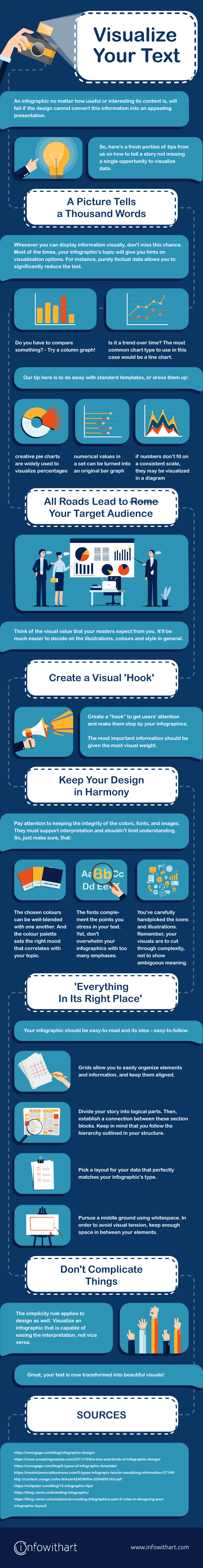
For instance, purely factual data allows you to significantly reduce the text. It can be presented it the form of charts. The kind of data you need to present will help to decide which type of chart would best convey it. Do you have to compare something? Try a column graph! Is it a trend over time? The most common chart type to use in this case would be a line chart.
A couple of tips here:
• creative pie charts are widely used to visualize percentages;
• numerical values in a set can be turned into an original bar graph;
• if numbers don’t fit on a consistent scale, they may be visualized in a diagram.
On the other hand, there’s data that can be misinterpreted if shown only visually. So, you’ve got to find a balance between the images and their textual explanations. Basically, do away with standard templates, or, at least, dress them up
All Roads Lead to Rome Your Target Audience
You must have already taken your time to study your audience while you were writing the text for your infographics. Now, repeat the same while you’re working on data visualization. Ask yourself what visual value would the readers expect from you. It’ll help you to decide upon the illustrations, colours and style in general.
Create a Visual ‘Hook’
Every day marketing managers, bloggers, promoters participate in a constant struggle. Users attention is the main trophy. So, do you want to win and make the viewers stop by your infographics? Create a “hook” for them, then. The most important information should be given the most visual weight.
Here’s a brief tip. It’s better to place your visual hook at either the center or very end of the infographics. In such a way, it’ll grab more attention.
Keep Your Design in Harmony
Most probably, you want your infographic to get its message across effectively. For that to happen, it must introduce the fundamental idea of the given topic. Moreover, it has to precisely highlight the concept of each thematic block. And, of course, quantitative and qualitative data should be presented clearly as well.
Pay attention to keeping the integrity of the colours, fonts, and images. They must support interpretation and shouldn’t limit understanding.
A few hacks for you:
• The chosen colours can be well-blended with one another. And the colour palette sets the right mood that correlates with your topic;
• The fonts complement the points you stress in your text. Yet, don’t overwhelm your infographics with too many emphases;
• You’ve carefully handpicked the icons and illustrations. Remember, your visuals are to cut through complexity, not to show ambiguous meaning;
In general, it’s about creating visual balance. A balanced infographics keeps the composition cohesive and is pleasing to the eyes. Because everything fits together seamlessly.
‘Everything In Its Right Place’
This Radiohead’s famous hit is valuable for both your MP3 playlist and, who’d have thought, your infographic design principles! Put everything in its place. These guys know what they’re singing about. It’s not as if we stand out against chaotic order or orderly chaos. The thing is, your infographic should be easy-to-read and its idea – easy-to-follow. In short, it should make sense. Preferably, not only to you, but to your readers too.
What should you do to make it happen? Start with organizing your infographic. It’s not the easiest task since the viewers are capricious in terms of staying interested till the end. But no worries! We’ve collected some tips to make your life easier.
Grids and wireframes
Don’t ignore such a structural base of any design as grids and wireframes. Grids allow you to easily organize elements and information, and keep them aligned. Wireframes will prevent you from reorganizing frustration after having already made a lot of design elements. Determine what to show and how to show it by setting-up your storyline at the start.
Section blocks
Divide your story into logical parts. Then, establish a connection between these section blocks. Keep in mind that you follow the hierarchy outlined in your structure.
Layout
Pick a layout for your data that perfectly matches your infographic’s type. Just to give you an idea, a one-column layout complements a minimal infographic. At the same time, a list infographic would work better if the layout was split into two columns. Also, you could break up sections with borders or backgrounds of different shapes. Actually, you have plenty of options.
Whitespace
Whitespace is so important in graphic design that sometimes this word sounds like a mantra. Anyway, it’s a tricky one. Because a page crammed full of text looks just as bad as the one with too many empty spaces. It’s a challenge to read something in the first case. The second option will, probably, look incomplete. As usual, the best option is to pursue a middle ground. In order to avoid visual tension, keep enough space in between your elements and the edge of your canvas.
Don’t Complicate Things
As you’ve learned from our article “Make Your Content Scoring, Not Boring”, “The less content – the better for infographics”. The simplicity rule applies to design as well. Visualize an infographic that is capable of easing the interpretation, not vice versa. The reader must quickly understand your message the first time he looks at it. So he doesn’t need to dig deeper. Just serve everything in one plate.
Great, your text is now transformed into beautiful visuals! Yet, it’s not over. There’s always room for improvement. So, stay with us and learn how to make your infographics design even more appealing.
SOURCES
venngage.com/blog/infographic-design
smashingmagazine.com/2011/10/the-dos-and-donts-of-infographic-design
venngage.com/blog/9-types-of-infographic-template
maximizesocialbusiness.com/5-types-infographic-layouts-visualizing-information-27146
content.visage.co/hs-fs/hub/424038/file-2094950163-pdf
neilpatel.com/blog/12-infographic-tips
blog.visme.co/branding-infographic
blog.visme.co/solutions-to-creating-infographics-part-2-rules-in-designing-your-infographic-layout