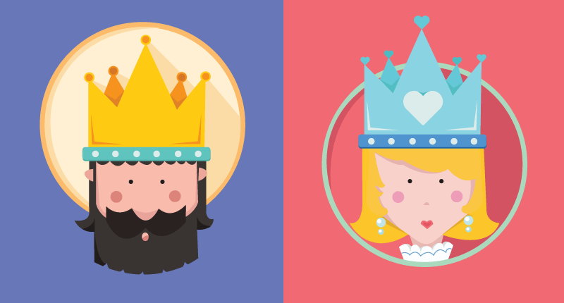
Content is King, But Design is Queen
5th August, 2016 | By Lia Freimyt
The King gets all the glory. All the credit.
But the Queen has the King’s ear. She moves strings from behind the scenes. You might not notice her, but she’s integral to the whole operation.
Without her, everything falls apart.
She’s just like your design.
Your design is critical to your engagement. And while your content is the main attraction, without good design it’s wasted.
Good design makes it easy to engage with your content. While some people will subscribe to your mailing list, share your content, and follow you on social media, most are lazy.
They’re only going to engage with you if you make it easy to. They’re busy. They have a ton to do. While your blog is great, they aren’t going to go out of their way.
But if you make your blog’s experience seamless. If you remove the friction and barriers to your engagement. And send your audience call-to-actions at the right time, they’ll do just about anything you want.
Which means you can drastically increase your engagement, just by changing the way you present your content.
Make no mistake, the king and queen need to be together in order to rule the kingdom. With your web page as the kingdom, content and design should blend beautifully together into a nice and elegant union. The content may be the most important aspect, but the design helps to enhance your page in all of the right ways.
An infographic could be your secret weapon in this battle for the attention of your audience. So, let’s make difficult things simple.


