WP-Tonic Website


Customer goal
The solution
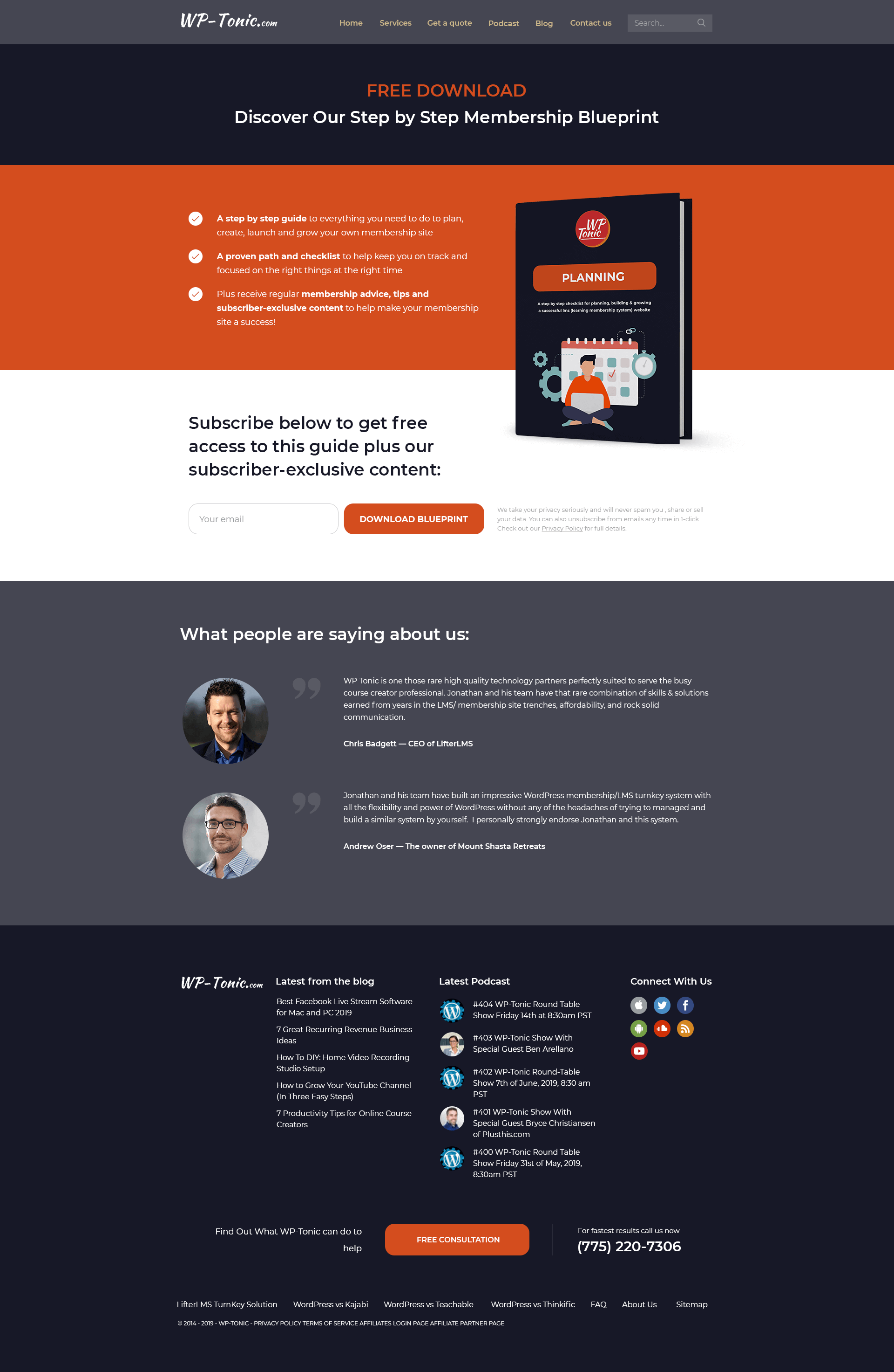
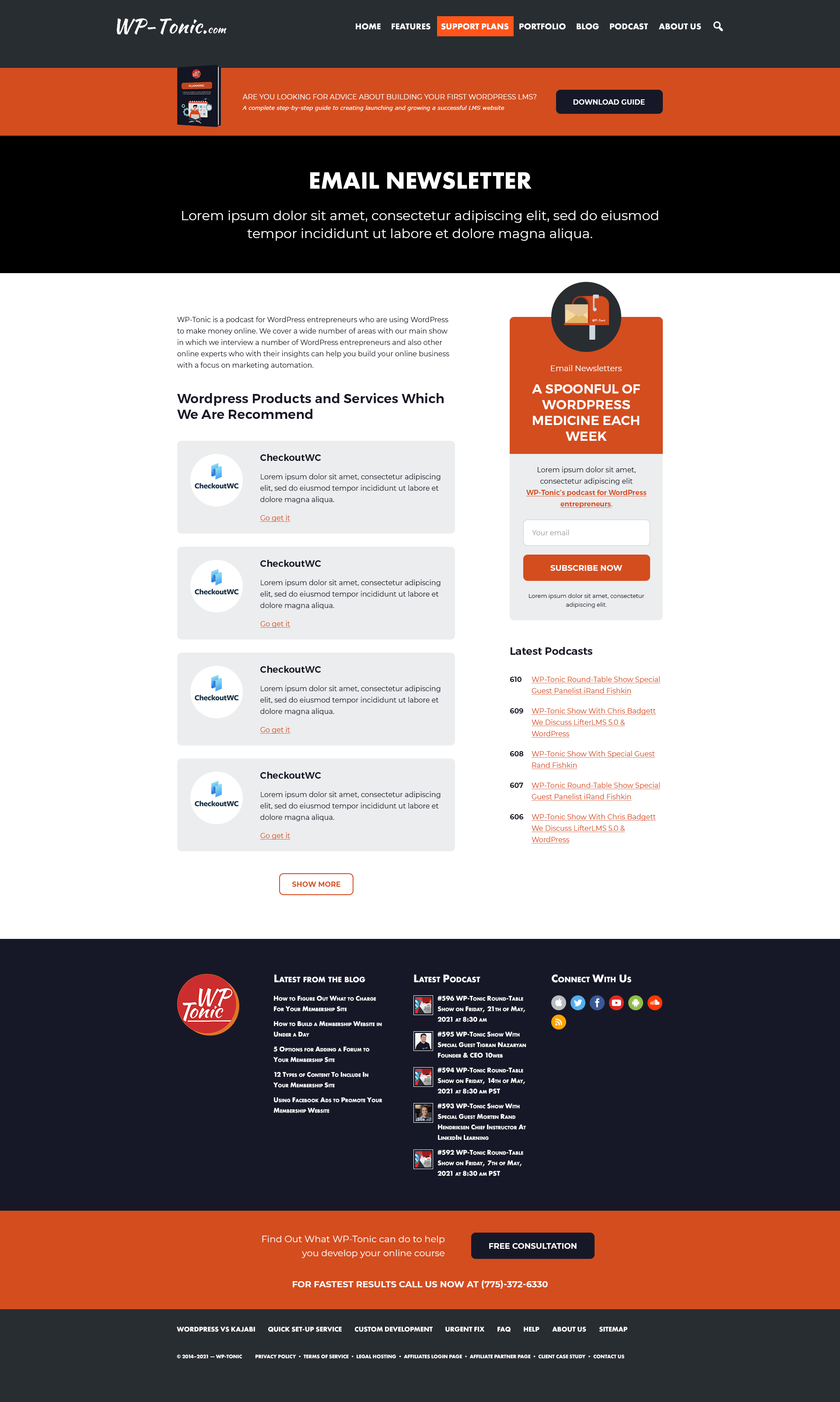
Create a website design for WordPress experts team. The main objective is to organize a clean layout and communicate the primary message to the WP-Tonic’s potential clients.
First of all, our team presented the clean website structure which served as the basis for the rest of the design. The alternation of dark and white sections backgrounds created a great contrast. Though the background colors were basically limited to the black-and-white palette, we decided to add some colorful vibes and chose juicy and vivid colors for the website illustrations and icons. So, the minimalistic approach kept our focus on the primary message our client wanted to transmit to his target audience.
Category- Web Design
- Landing Pages
- Vector Graphics
- Business & Consulting
- SaaS
- Technology
- Flat


