Redberry Webpage Design

Customer goal
The solution
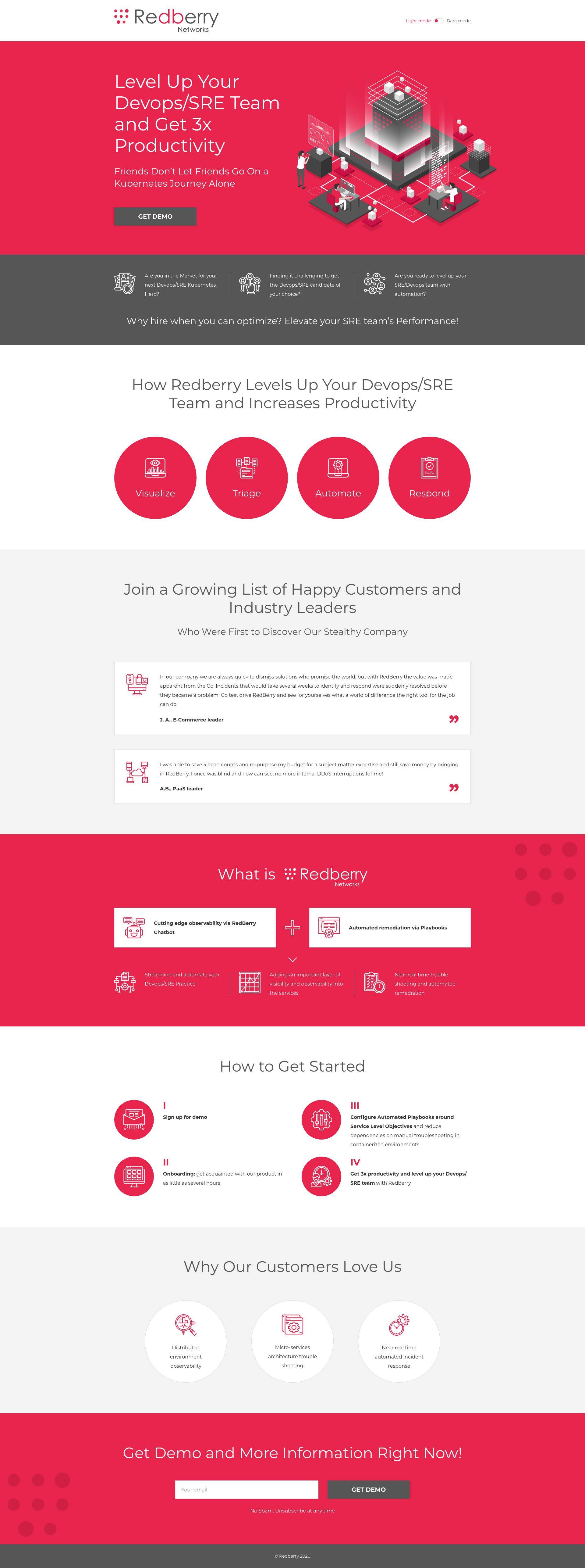
To create a webpage design that describes Redberrys product and solution so you wouldn’t have to go on a kubernets journey alone.
For this website we’ve created a big hero isometric illustration next to a get demo button to make sure this block is clearly visible for the user. Simple line-art icons helped us to achieve the clean look for a website. This website also has two themes Light and Dark.
Category- Web Design
- Landing Pages
- Vector Graphics
- Business & Consulting
- Technology
- Isometric
- Outline


