Infographics for Art of Visualization
Customer goal
The solution
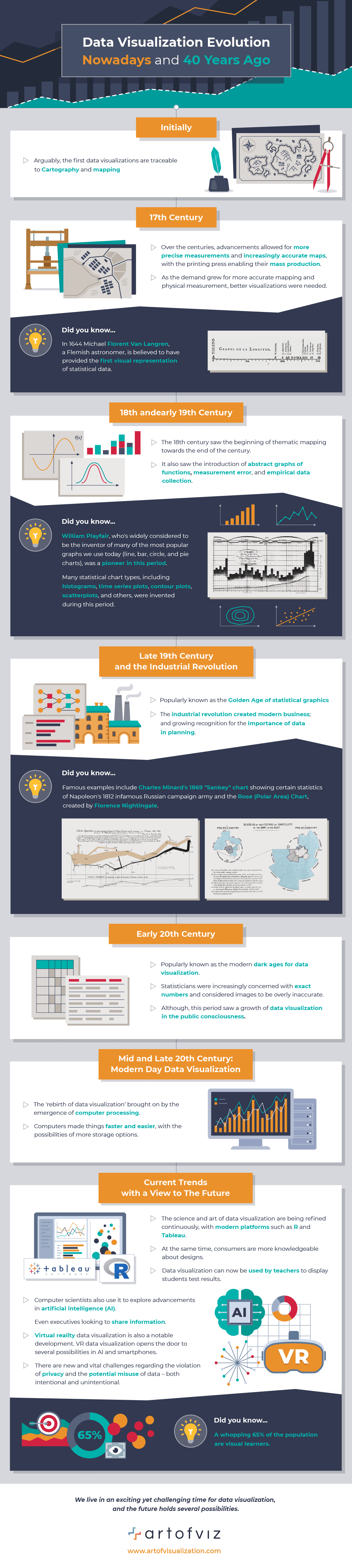
To design an infographic on how data visualization language was changing throughout history.
This infographic was made in a flat style with the use of different charts/maps and graphs that correspond to different historical periods from the 17th century to current data visualization trends.
As a result, we have interesting and fun reading infographics with a simple and not overwhelming design style.
- Infographics
- Informational
- Timeline
- Education
- Science
- Technology
- Flat
- Outline